Mobile devices come in all sorts of different sizes so it 's important for the text on your site to have a font size that is legible on different screen sizes. The text needs to be big enough to be read without pinching to zoom but, at the same time, not be too big that users need to scroll forever to read all the content.
Having a font size that users can read comfortably needing to zoom or switch to landscape gives people visiting your site on mobile devices a much better experience, which is what mobile friendliness is all about.
What is the Ideal Mobile Font Size?
The ideal mobile site has text that is comfortably readable when the user is looking at their phone at a comfortable distance.
The ideal base font size for mobile screens is 16 pixels. Anything smaller and users will have to pinch and zoom to read. In your site 's CSS, it 's recommended to set the font-size attribute in "ems" to make it more easily scaled.
Using ems is helpful because it changes text relative to the size set in the document.
How to Make Sure Your Text is Legible on All Screens
1. Research mobile theme or template
If you are using WordPress, Shopify or other CMS platform, you can simply purchase a mobile theme or template that will make your site responsive automatically. The text will resize automatically to suit the device being used.
Before settling on a theme or template, be sure to read the reviews of web designers who have used it before and look at sites that use the particular theme or template to see whether it appeals to you.
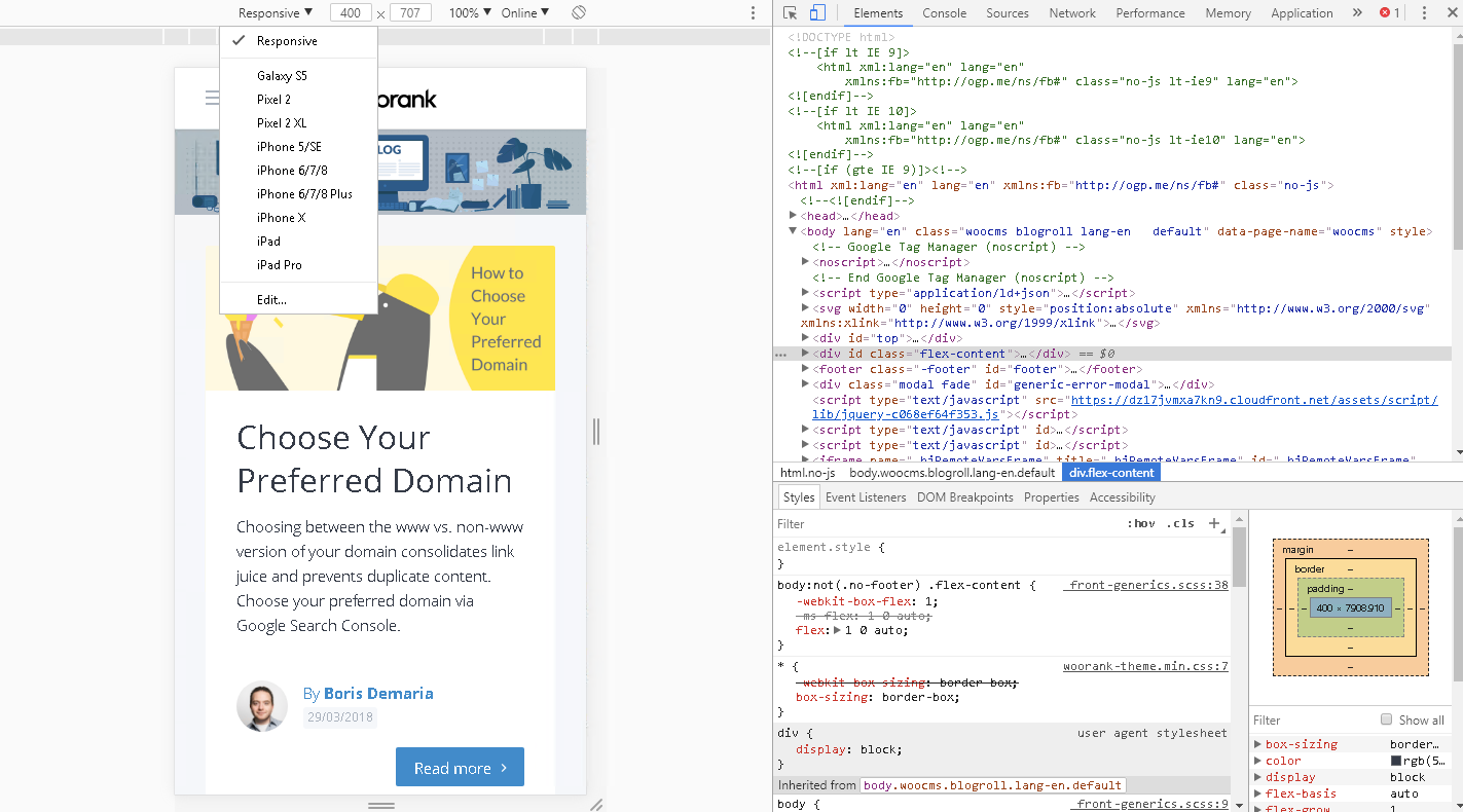
Most themes provide live demo before purchasing so that you can test the theme on your desktop and click on "Inspect Element" to view the site 's template layout based on few screen sizes:
Whether you are using a theme or custom web design, you 'll need to specify your mobile viewport.
2. Implement mobile responsive design
You can use CSS to manage your site 's font size across different devices. The procedure is very simple:
Font size can use different units of measures to declare how big your text should be:
- pixels (px)
- points (pt)
- EMs (em)
- percent (%)
The general recommendation is to use the browser default of 1.2em, 12pt, 16px or p{font-size:120%;}.
Here 's a list of conversion for each measure:
Pixels EMs Percent Points 6px 0.375em 37.5% 5pt 7px 0.438em 43.8% 5pt 8px 0.500em 50.0% 6pt 9px 0.563em 56.3% 7pt 10px 0.625em 62.5% 8pt 11px 0.688em 68.8% 8pt 12px 0.750em 75.0% 9pt 13px 0.813em 81.3% 10pt 14px 0.875em 87.5% 11pt 15px 0.938em 93.8% 11pt 16px 1.000em 100.0% 12pt 17px 1.063em 106.3% 13pt 18px 1.125em 112.5% 14pt 19px 1.188em 118.8% 14pt 20px 1.250em 125.0% 15pt 21px 1.313em 131.3% 16pt 22px 1.375em 137.5% 17pt 23px 1.438em 143.8% 17pt 24px 1.500em 150.0% 18pt
Choose a reasonable font size for each type: Title, Headings, Paragraphs. 16 pixels is the default CSS setting. Most themes you installed for your site would have additional theme settings to make it easy for you to change the size based on your site and visitors needs.
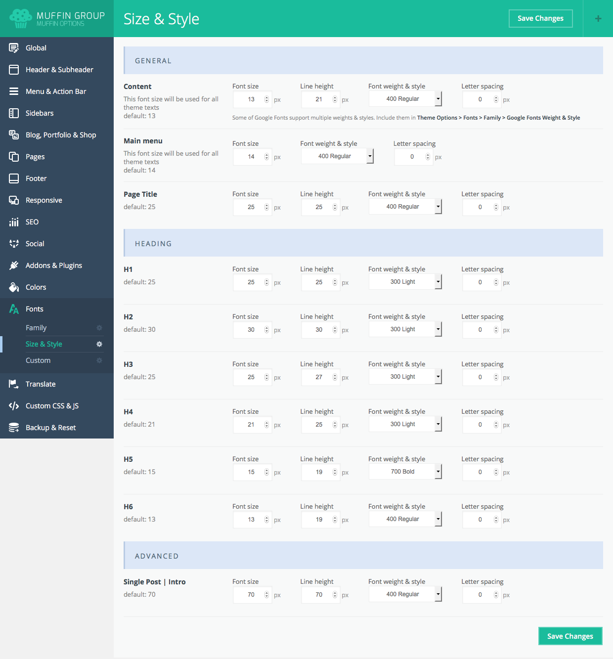
Here 's an example of the Muffin Builder theme options:
Do not use a size that is too big [size 20 or more]. Leave this for headlines and titles. Large font sizes mean that users will have to scroll longer, which isn 't user friendly.
Rule of Thumb:
Classic readability theory suggests that an ideal column should contain 70 to 80 characters per line (about 8 to 10 words in English). Thus, each time the width of a text block grows past about 10 words, consider adding a breakpoint.
Adjust this font size depending on the features of the font you are using.
Consider the base size when choosing a font size to use. This is because the content will be viewed on devices of different sizes and you want to be sure that the font size relationships will always be the same regardless of the device on which the content is being viewed on.
3. Height size for your font
Be sure to leave enough space between the lines and paragraphs so that the page does not look too cramped. While you can get away with small line heights and tight text on a desktop site, it will be almost impossible for a user to read such text on a device with a small screen without zooming and this makes for a rather unpleasant experience.
For links, you will have to leave even more space between lines of text for tap screen readiness.
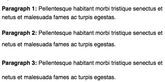
The three paragraph examples aboce provided by css-tricks have their line-heights set to 150%, 200% and 250% or 30px, 40px and 50px.
Google recommends using at least the browser default line-height of 1.2 which means that the spaces between lines of text are at least 1.2 times the size of the text itself.
4. Media queries for different screen size
The size of your site 's text is controlled by the media queries declared for different sized screens. You can customize each font size based on the different screen size in your CSS file. An example would be:
html{font-size:100%;}
@media(min-width:60em){html{font-size:100%}}
There are several different items you can query on: min-width, max-width, min-height, and max-height.
Here are some media queries rules based on Google 's recommendation:
- When the browser is between 0px and 640px wide, max-640px.css is applied.
- When the browser is between 500px and 600px wide, styles within the @media is applied.
- When the browser is 640px or wider, min-640px.css is applied.
- When the browser width is greater than the height, landscape.css is applied.
- When the browser height is greater than the width, portrait.css is applied.
To avoid over-complication, do not use too many fonts and font sizes on one page as this can make it more difficult to control your text 's legibility across different devices. Your page layout will also be messy and the text may even be unreadable on devices with small screens.
5. Design different versions of your website for different devices
Creating a separate mobile website is an option if you can 't create a responsive design for some reason. Using a separate mobile site isn 't ideal (it 's more work to create and maintain), but it has worked for some websites.
The most common way of doing this is to use what 's often known as an "m-dots". An "m-dot" is an entirely new site designed to be mobile friendly and then hosted at a subdomain, usually ".example.com". Hence the term "m-dot".
You would then redirect mobile users to the mobile version of your site.
More Resources About Mobile Friendliness
Font size may seem like a small thing, but it is a vital element of mobile-first SEO. The above strategies will help in ensuring that your font is easily readable to peole on a mobile device. Read our other guides to make your site ore mobile friendly:


